Hi, I have a CSS Grid that looks great:
In the editor on desktop & mobile
In the browser on my desktop
In the browser on my desktop in the inspector mobile view
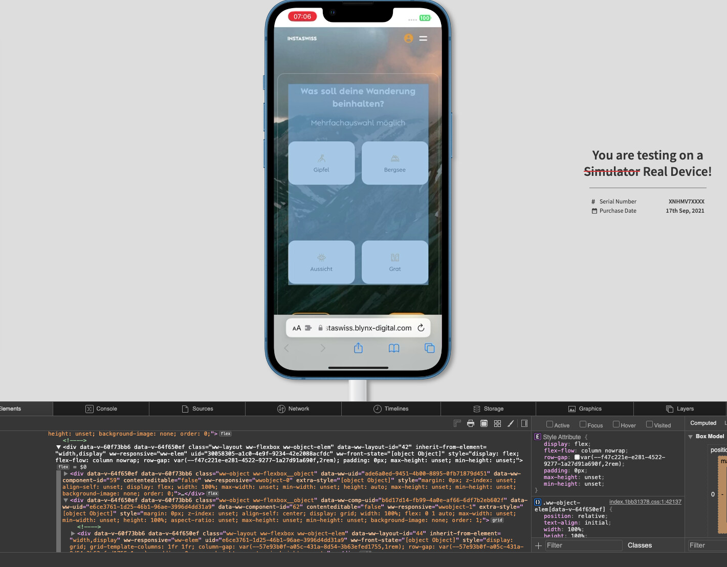
The problem I have is that each grid item has extra height added when It on any browser (safari & Chrome) on a mobile device. I’ve tested on different devices as well so I’t snot device specific.
You can see in the second picture below how extra space is somehow added.
I’m hoping I’ve just missed a setting somewhere thats causing this and I’d be grateful for any help at all.
i had the same issue and found the following solution to the problem:
Safari has a weird bug that “mixing” flex box with grids can cause this big gap. which means the parent element of the cdd grid shouldn’t be a flex box. the solution is just to have a display:block as the parent of the actual grid itself. here are some screenshots from my tests on Browserstack: