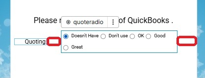
I have two elements in a container. 1st is a text box, 2nd is a radio input. I am trying to span the container and used width percentages of each element to “fit” except they don’t. With 20% width of the text element and 80% width of the radio input element I get this spacing in red. I went and tried to style the container 1 step higher but all the is set to is center each child element. Any suggestions?
Use the grid layout instead of flex, it will be 100% accurate then
Here is a styled up example. My theory is that there is a css property I am missing that is adding padding to the right and left of the radio input. The top container is my original. The middle container is the same as the top except I set the text element to width auto and the radio input to width 100%. The last container is the grid with two columns, 1st column set to 20% and second column set to 80%.
My “survey” app works well in both web and mobile so I am staying with a fixed width on my parent container.

Yeah I think you might wanna play around with this a little more, this should also work with flex as you have it set up, can’t really do much without laying my hands on it to be honest.