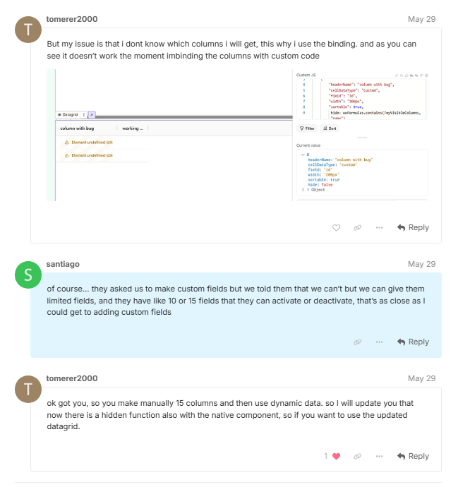
Hello everyone! I come to confirm if this is a bug or not, when I use one of the new elements “data/grid” this receives an array of objects, inside we can define what type of cell we want, if we use “Custom” this generates a space to interact within the component, but this is not happening if we pass the array by a formula as I leave in the images.
I would like to know if this is a bug or if it is intended. thank you very much.


Hi @santiago
Sorry, it’s a technical limitation. For now, it’s not possible to use custom types with dynamic columns. It’s something the team is aware of, and we’re reviewing feedback on cases like yours as we continue improving the data grid.
thank you! I solved this changing the component and adding a “visible” option for the rows, and now I can use the custom types 
Hey @santiago ,
Can you elaborate on your solution, as I also got stuck because of this limitation.
Cheers!!


at first what I did was to grab the data grid element base from weweb and hit “fork component” and there I was able to access the component code

wow nice job, can you show the changes that you did to the component.
or did you use the AI feature for it.
I really appreciate the help:]
thank you! I used the AI it’s really helpfull
pro tip: you can use the ag-grid documentation for guide the AI
I used to create “on sort” event and “on row clicked” event
This is exactly what i need. Would you be willing to share the javascript to create an “on row click” event. I’ve been trying but even with the AI its failed.
Hey Santiago, I would also appreciate it if you could share the “upgraded” component, it’s not working so smoothly for me :]
Hi guys This is the coded component

AI.md
---
name: ww-datagrid-ag
description: An advanced datagrid supporting sort, filter, selection, virtual scroll, and loading states. Based on AG grid
keywords:
- datagrid
- table
- loading
- skeleton
---

#### ww-datagrid-ag

1. **Component Purpose:**
A highly customizable data grid/table component that supports features like sorting, filtering, pagination, row selection, loading states, and custom actions. It's designed to handle large datasets efficiently with various data types and styling options. Its based on the AGGrid framework

2. **Properties:**
- `rowData`: `Array<object>` - MANDATORY - Data to display in the grid. Default: `[]`.
- `fetchingData`: `boolean` - Controls the loading state of the grid. When true, displays skeleton loaders for rows while keeping the header visible. Default: `false`.
- `idFormula`: `Formula` - MANDATORY - Formula to generate unique IDs for each row. . Always use 'context.mapping...'
- `height`: `string` - Height of the grid. Default: `"400px"`.
- `textColor`: `string` - Color of all the text in the grid. Use more specific field if needed (headerTextColor, cellColor, actionColor)
- `headerBackgroundColor`: `string | null` - Background color of the header cells.
- `headerTextColor`: `string | null` - Text color of the header cells.
- `headerFontWeight`: `null | 100 | 200 | 300 | 400 | 500 | 600 | 700 | 800 | 900` - Font weight of header text.
- `headerFontSize`: `string` - Font size of header text.
- `headerFontFamily`: `string` - Font family for header text.
- `borderColor`: `string | null` - Color of grid borders.
- `cellColor`: `string | null` - Text color of grid cells.
- `cellFontFamily`: `string` - Font family for cell text.
- `cellFontSize`: `string` - Font size for cell text.
- `rowBackgroundColor`: `string | null` - Background color for rows.
- `rowAlternateColor`: `string | null` - Background color for alternate rows. Be sure it works well with cell default text color, as the color is common
- `rowHoverColor`: `string | null` - Background color when hovering over rows. Must be a semi transparent color, at it will be an overlay on top
- `rowVerticalPaddingScale`: `Number | null` - A number for scaling the vertical padding of cells. Use 2 to multiply it by 2 or a number between 0 and 1 to make it smaller.
- `columnHoverHighlight`: `string | null` - Does column highlight on hover is active
- `columnHoverColor`: `string | null` - If active, column hover highlight. Must be a semi transparent color, at it will be an overlay on top
- `selectedRowBackgroundColor`: `string | null` - Background color for selected rows. Must be a semi transparent color, at it will be an overlay on top
- `menuTextColor`: `string | null` - Text color for the filter menu
- `menuBackgroundColor`: `string | null` - Background color for the filter menu
- `actionColor`: `string | null` - Text color for action buttons.
- `actionBackgroundColor`: `string | null` - Background color for action buttons.
- `actionPadding`: `string` - Padding for action buttons.
- `actionBorder`: `string` - Border style for action buttons.
- `actionBorderRadius`: `string` - Border radius for action buttons.
- `actionFontSize`: `string`: Font size of the button in action column
- `actionFontFamily`: `string`: Font family of the button in action column
- `actionFontWeight`: `string`: Font weight of the button in action column
- `actionFontStyle`: `string`: Font style of the button in action column
- `actionLineHeight`: `string`: Line height of the button in action column
- `rowSelection`: `'none' | 'single' | 'multiple'` - Type of row selection. Default: `"none"`. Must be a semi transparent color, at it will be an overlay on top
- `pagination`: `boolean` - Enable/disable pagination. Default: `false`.
- `paginationPageSize`: `number` - Number of rows per page. Default: `10`.
- `columns`: `Array<{
headerName: string,
cellDataType: 'text' | 'number' | 'boolean' | 'dateString',
field: string,
visible: boolean, // Whether the column is visible in the grid. Default: true
useCustomLabel: boolean, // Default: false, if true, displayLabelFormula is used to format the label
displayLabelFormula: Formula, // Only if useCustomLabel is true
widthAlgo: 'flex' | 'fixed', // Default: 'fixed'
width: string, // Only if widthAlgo is 'fixed'
flex: number, // Only if widthAlgo is 'flex'
minWidth: string,
maxWidth: string,
width: string,
flex: number,
filter: boolean,
sortable: boolean,
pinned: undefined | 'left' | 'right'
} | {
headerName: string,
cellDataType:'image',
field: string,
visible: boolean, // Whether the column is visible in the grid. Default: true
widthAlgo: 'flex' | 'fixed', // Default: 'fixed'
width: string, // Only if widthAlgo is 'fixed'
flex: number, // Only if widthAlgo is 'flex'
minWidth: string,
maxWidth: string,
width: string,
flex: number,
imageWidth: string,
imageHeight: string,
pinned: undefined | 'left' | 'right'
} | {
headerName: string,
cellDataType:'action',
field: string,
visible: boolean, // Whether the column is visible in the grid. Default: true
widthAlgo: 'flex' | 'fixed', // Default: 'fixed'
width: string, // Only if widthAlgo is 'fixed'
flex: number, // Only if widthAlgo is 'flex'
minWidth: string,
maxWidth: string,
width: string,
flex: number,
actionName: string,
actionLabel: string,
pinned: undefined | 'left' | 'right'
}>` - Column configurations. Each object describe a column of the grid, and some options may depends on the selected type of data. For each object, width can be undefined, if defined its must be a string in the shape of {value}px. Flex will be ignore if width is defined or equal to auto and must be an integer.`

3. **Children Components:**

There is no children.

4. **Special Features:**
- Loading state with skeleton loaders for rows while keeping the header visible
- Supports multiple data types including text, numbers, dates, images, and action buttons
- Advanced filtering and sorting capabilities
- Customizable pagination
- Single and multiple row selection modes
- Custom action buttons with styling options
- Responsive design with customizable column widths
- Row hover and selection states
- Alternate row coloring
- Comprehensive header and cell styling options
- Cursor pointer on rows for better click interaction feedback

5. **Events:**

- action: Triggered when clicking on a action cell. Payload: { actionName: 'name of the column', row: { /* row data */}, id: 0, index: 0, displayIndex: 0 }
- cellValueChanged: Triggered after a cell edition so that you can update the data source. Payload: { oldValue: {/* old value */}, newValue: { /* row data */}, columnId: "id", row: { /* row data */} }
- rowSelected: triggered when a row is selected. Payload: { row: { /* row data */} }
- rowDeselected: triggered when a row is deselected. Payload: { row: { /* row data */} }
- sort: triggered when a column is sorted. Payload: { column: "columnName", sort: "asc" | "desc", source: "uiColumnSorted", columns: [{ colId: "columnName" }], api: {}, context: {}, type: "sortChanged" }
- headerFocused: triggered when a column header is focused. Payload: { column: { colId: "columnName", colDef: {...} }, api: {...}, context: {...}, type: "headerFocused" }
- rowClicked: triggered when a row is clicked. Payload: { data: { /* row data */}, node: { id: "0", rowIndex: 0, data: { /* row data */} }, rowIndex: 0, rowPinned: null, api: {}, context: {}, type: "rowClicked" }

6. **Actions:**

- `sort`: Programmatically sort the grid. Args: columnId (string), sort (string - 'asc' or 'desc')

7. **Notes:**

- idFormula is 'Formula' type (ex: `{ "wwFormula": "context.mapping..." }`, must always use wwFormula, wwJavascript is not allowed). Be sure it is unique per row
- The loading state can be controlled by binding the fetchingData property to a variable that tracks your data loading state
- Skeleton loaders automatically adapt to your column configuration and pagination settings while keeping the header visible
- All rows now display a pointer cursor to indicate they are clickable
**CRITICAL** : You have to perfectly style this datagrid according to the page.
- Default theme is usually great, use other colors only if you need to be on brand
package-lock.json
{
  "name": "ag-grid-table",
  "version": "1.12.0",
  "lockfileVersion": 3,
  "requires": true,
  "packages": {
    "": {
      "name": "ag-grid-table",
      "version": "1.12.0",
      "dependencies": {
        "ag-grid-vue3": "33.0.4"
      },
      "devDependencies": {}
    },
    "node_modules/@babel/helper-string-parser": {
      "version": "7.27.1",
      "resolved": "https://registry.npmjs.org/@babel/helper-string-parser/-/helper-string-parser-7.27.1.tgz",
      "integrity": "sha512-qMlSxKbpRlAridDExk92nSobyDdpPijUq2DW6oDnUqd0iOGxmQjyqhMIihI9+zv4LPyZdRje2cavWPbCbWm3eA==",
      "license": "MIT",
      "peer": true,
      "engines": {
        "node": ">=6.9.0"
      }
    },
    "node_modules/@babel/helper-validator-identifier": {
      "version": "7.27.1",
      "resolved": "https://registry.npmjs.org/@babel/helper-validator-identifier/-/helper-validator-identifier-7.27.1.tgz",
      "integrity": "sha512-D2hP9eA+Sqx1kBZgzxZh0y1trbuU+JoDkiEwqhQ36nodYqJwyEIhPSdMNd7lOm/4io72luTPWH20Yda0xOuUow==",
      "license": "MIT",
      "peer": true,
      "engines": {
        "node": ">=6.9.0"
      }
    },
    "node_modules/@babel/parser": {
      "version": "7.27.2",
      "resolved": "https://registry.npmjs.org/@babel/parser/-/parser-7.27.2.tgz",
      "integrity": "sha512-QYLs8299NA7WM/bZAdp+CviYYkVoYXlDW2rzliy3chxd1PQjej7JORuMJDJXJUb9g0TT+B99EwaVLKmX+sPXWw==",
      "license": "MIT",
      "peer": true,
      "dependencies": {
        "@babel/types": "^7.27.1"
      },
      "bin": {
        "parser": "bin/babel-parser.js"
      },
      "engines": {
        "node": ">=6.0.0"
      }
    },
    "node_modules/@babel/types": {
      "version": "7.27.1",
      "resolved": "https://registry.npmjs.org/@babel/types/-/types-7.27.1.tgz",
      "integrity": "sha512-+EzkxvLNfiUeKMgy/3luqfsCWFRXLb7U6wNQTk60tovuckwB15B191tJWvpp4HjiQWdJkCxO3Wbvc6jlk3Xb2Q==",
      "license": "MIT",
      "peer": true,
      "dependencies": {
        "@babel/helper-string-parser": "^7.27.1",
        "@babel/helper-validator-identifier": "^7.27.1"
      },
      "engines": {
        "node": ">=6.9.0"
      }
    },
    "node_modules/@jridgewell/sourcemap-codec": {
      "version": "1.5.0",
      "resolved": "https://registry.npmjs.org/@jridgewell/sourcemap-codec/-/sourcemap-codec-1.5.0.tgz",
      "integrity": "sha512-gv3ZRaISU3fjPAgNsriBRqGWQL6quFx04YMPW/zD8XMLsU32mhCCbfbO6KZFLjvYpCZ8zyDEgqsgf+PwPaM7GQ==",
      "license": "MIT",
      "peer": true
    },
    "node_modules/@vue/compiler-core": {
      "version": "3.5.13",
      "resolved": "https://registry.npmjs.org/@vue/compiler-core/-/compiler-core-3.5.13.tgz",
      "integrity": "sha512-oOdAkwqUfW1WqpwSYJce06wvt6HljgY3fGeM9NcVA1HaYOij3mZG9Rkysn0OHuyUAGMbEbARIpsG+LPVlBJ5/Q==",
      "license": "MIT",
      "peer": true,
      "dependencies": {
        "@babel/parser": "^7.25.3",
        "@vue/shared": "3.5.13",
        "entities": "^4.5.0",
        "estree-walker": "^2.0.2",
        "source-map-js": "^1.2.0"
      }
    },
    "node_modules/@vue/compiler-dom": {
      "version": "3.5.13",
      "resolved": "https://registry.npmjs.org/@vue/compiler-dom/-/compiler-dom-3.5.13.tgz",
      "integrity": "sha512-ZOJ46sMOKUjO3e94wPdCzQ6P1Lx/vhp2RSvfaab88Ajexs0AHeV0uasYhi99WPaogmBlRHNRuly8xV75cNTMDA==",
      "license": "MIT",
      "peer": true,
      "dependencies": {
        "@vue/compiler-core": "3.5.13",
        "@vue/shared": "3.5.13"
      }
    },
    "node_modules/@vue/compiler-sfc": {
      "version": "3.5.13",
      "resolved": "https://registry.npmjs.org/@vue/compiler-sfc/-/compiler-sfc-3.5.13.tgz",
      "integrity": "sha512-6VdaljMpD82w6c2749Zhf5T9u5uLBWKnVue6XWxprDobftnletJ8+oel7sexFfM3qIxNmVE7LSFGTpv6obNyaQ==",
      "license": "MIT",
      "peer": true,
      "dependencies": {
        "@babel/parser": "^7.25.3",
        "@vue/compiler-core": "3.5.13",
        "@vue/compiler-dom": "3.5.13",
        "@vue/compiler-ssr": "3.5.13",
        "@vue/shared": "3.5.13",
        "estree-walker": "^2.0.2",
        "magic-string": "^0.30.11",
        "postcss": "^8.4.48",
        "source-map-js": "^1.2.0"
      }
    },
    "node_modules/@vue/compiler-ssr": {
      "version": "3.5.13",
      "resolved": "https://registry.npmjs.org/@vue/compiler-ssr/-/compiler-ssr-3.5.13.tgz",
      "integrity": "sha512-wMH6vrYHxQl/IybKJagqbquvxpWCuVYpoUJfCqFZwa/JY1GdATAQ+TgVtgrwwMZ0D07QhA99rs/EAAWfvG6KpA==",
      "license": "MIT",
      "peer": true,
      "dependencies": {
        "@vue/compiler-dom": "3.5.13",
        "@vue/shared": "3.5.13"
      }
    },
    "node_modules/@vue/reactivity": {
      "version": "3.5.13",
      "resolved": "https://registry.npmjs.org/@vue/reactivity/-/reactivity-3.5.13.tgz",
      "integrity": "sha512-NaCwtw8o48B9I6L1zl2p41OHo/2Z4wqYGGIK1Khu5T7yxrn+ATOixn/Udn2m+6kZKB/J7cuT9DbWWhRxqixACg==",
      "license": "MIT",
      "peer": true,
      "dependencies": {
        "@vue/shared": "3.5.13"
      }
    },
    "node_modules/@vue/runtime-core": {
      "version": "3.5.13",
      "resolved": "https://registry.npmjs.org/@vue/runtime-core/-/runtime-core-3.5.13.tgz",
      "integrity": "sha512-Fj4YRQ3Az0WTZw1sFe+QDb0aXCerigEpw418pw1HBUKFtnQHWzwojaukAs2X/c9DQz4MQ4bsXTGlcpGxU/RCIw==",
      "license": "MIT",
      "peer": true,
      "dependencies": {
        "@vue/reactivity": "3.5.13",
        "@vue/shared": "3.5.13"
      }
    },
    "node_modules/@vue/runtime-dom": {
      "version": "3.5.13",
      "resolved": "https://registry.npmjs.org/@vue/runtime-dom/-/runtime-dom-3.5.13.tgz",
      "integrity": "sha512-dLaj94s93NYLqjLiyFzVs9X6dWhTdAlEAciC3Moq7gzAc13VJUdCnjjRurNM6uTLFATRHexHCTu/Xp3eW6yoog==",
      "license": "MIT",
      "peer": true,
      "dependencies": {
        "@vue/reactivity": "3.5.13",
        "@vue/runtime-core": "3.5.13",
        "@vue/shared": "3.5.13",
        "csstype": "^3.1.3"
      }
    },
    "node_modules/@vue/server-renderer": {
      "version": "3.5.13",
      "resolved": "https://registry.npmjs.org/@vue/server-renderer/-/server-renderer-3.5.13.tgz",
      "integrity": "sha512-wAi4IRJV/2SAW3htkTlB+dHeRmpTiVIK1OGLWV1yeStVSebSQQOwGwIq0D3ZIoBj2C2qpgz5+vX9iEBkTdk5YA==",
      "license": "MIT",
      "peer": true,
      "dependencies": {
        "@vue/compiler-ssr": "3.5.13",
        "@vue/shared": "3.5.13"
      },
      "peerDependencies": {
        "vue": "3.5.13"
      }
    },
    "node_modules/@vue/shared": {
      "version": "3.5.13",
      "resolved": "https://registry.npmjs.org/@vue/shared/-/shared-3.5.13.tgz",
      "integrity": "sha512-/hnE/qP5ZoGpol0a5mDi45bOd7t3tjYJBjsgCsivow7D48cJeV5l05RD82lPqi7gRiphZM37rnhW1l6ZoCNNnQ==",
      "license": "MIT",
      "peer": true
    },
    "node_modules/ag-charts-types": {
      "version": "11.0.4",
      "resolved": "https://registry.npmjs.org/ag-charts-types/-/ag-charts-types-11.0.4.tgz",
      "integrity": "sha512-K/Mi7FXvSCoABLSrqQ70k1QrIL5R6RNCt2NAppOxMEir+DVFPqKZtghruobc2MGVUUKkT9MCn6Dun+fL6yZjfA==",
      "license": "MIT"
    },
    "node_modules/ag-grid-community": {
      "version": "33.0.4",
      "resolved": "https://registry.npmjs.org/ag-grid-community/-/ag-grid-community-33.0.4.tgz",
      "integrity": "sha512-iBD8g8bNIl95w9CzCQpDid+eTdmOoT39204sPUOhE9eE50vfoDHIaF5U4fRYQHbLsT4bwbXfQYdsqBAOLJL24w==",
      "license": "MIT",
      "dependencies": {
        "ag-charts-types": "11.0.4"
      }
    },
    "node_modules/ag-grid-vue3": {
      "version": "33.0.4",
      "resolved": "https://registry.npmjs.org/ag-grid-vue3/-/ag-grid-vue3-33.0.4.tgz",
      "integrity": "sha512-aqAd+xGMbi/nnWGhaclKBjHa1NbIpIqVdAUE+hHyGHGD2a6KK3zftPL2TokrBkWCEhKbseHz1blVNT1q67O3nQ==",
      "license": "MIT",
      "dependencies": {
        "ag-grid-community": "33.0.4"
      },
      "peerDependencies": {
        "vue": "^3.5.0"
      }
    },
    "node_modules/csstype": {
      "version": "3.1.3",
      "resolved": "https://registry.npmjs.org/csstype/-/csstype-3.1.3.tgz",
      "integrity": "sha512-M1uQkMl8rQK/szD0LNhtqxIPLpimGm8sOBwU7lLnCpSbTyY3yeU1Vc7l4KT5zT4s/yOxHH5O7tIuuLOCnLADRw==",
      "license": "MIT",
      "peer": true
    },
    "node_modules/entities": {
      "version": "4.5.0",
      "resolved": "https://registry.npmjs.org/entities/-/entities-4.5.0.tgz",
      "integrity": "sha512-V0hjH4dGPh9Ao5p0MoRY6BVqtwCjhz6vI5LT8AJ55H+4g9/4vbHx1I54fS0XuclLhDHArPQCiMjDxjaL8fPxhw==",
      "license": "BSD-2-Clause",
      "peer": true,
      "engines": {
        "node": ">=0.12"
      },
      "funding": {
        "url": "https://github.com/fb55/entities?sponsor=1"
      }
    },
    "node_modules/estree-walker": {
      "version": "2.0.2",
      "resolved": "https://registry.npmjs.org/estree-walker/-/estree-walker-2.0.2.tgz",
      "integrity": "sha512-Rfkk/Mp/DL7JVje3u18FxFujQlTNR2q6QfMSMB7AvCBx91NGj/ba3kCfza0f6dVDbw7YlRf/nDrn7pQrCCyQ/w==",
      "license": "MIT",
      "peer": true
    },
    "node_modules/magic-string": {
      "version": "0.30.17",
      "resolved": "https://registry.npmjs.org/magic-string/-/magic-string-0.30.17.tgz",
      "integrity": "sha512-sNPKHvyjVf7gyjwS4xGTaW/mCnF8wnjtifKBEhxfZ7E/S8tQ0rssrwGNn6q8JH/ohItJfSQp9mBtQYuTlH5QnA==",
      "license": "MIT",
      "peer": true,
      "dependencies": {
        "@jridgewell/sourcemap-codec": "^1.5.0"
      }
    },
    "node_modules/nanoid": {
      "version": "3.3.11",
      "resolved": "https://registry.npmjs.org/nanoid/-/nanoid-3.3.11.tgz",
      "integrity": "sha512-N8SpfPUnUp1bK+PMYW8qSWdl9U+wwNWI4QKxOYDy9JAro3WMX7p2OeVRF9v+347pnakNevPmiHhNmZ2HbFA76w==",
      "funding": [
        {
          "type": "github",
          "url": "https://github.com/sponsors/ai"
        }
      ],
      "license": "MIT",
      "peer": true,
      "bin": {
        "nanoid": "bin/nanoid.cjs"
      },
      "engines": {
        "node": "^10 || ^12 || ^13.7 || ^14 || >=15.0.1"
      }
    },
    "node_modules/picocolors": {
      "version": "1.1.1",
      "resolved": "https://registry.npmjs.org/picocolors/-/picocolors-1.1.1.tgz",
      "integrity": "sha512-xceH2snhtb5M9liqDsmEw56le376mTZkEX/jEb/RxNFyegNul7eNslCXP9FDj/Lcu0X8KEyMceP2ntpaHrDEVA==",
      "license": "ISC",
      "peer": true
    },
    "node_modules/postcss": {
      "version": "8.5.3",
      "resolved": "https://registry.npmjs.org/postcss/-/postcss-8.5.3.tgz",
      "integrity": "sha512-dle9A3yYxlBSrt8Fu+IpjGT8SY8hN0mlaA6GY8t0P5PjIOZemULz/E2Bnm/2dcUOena75OTNkHI76uZBNUUq3A==",
      "funding": [
        {
          "type": "opencollective",
          "url": "https://opencollective.com/postcss/"
        },
        {
          "type": "tidelift",
          "url": "https://tidelift.com/funding/github/npm/postcss"
        },
        {
          "type": "github",
          "url": "https://github.com/sponsors/ai"
        }
      ],
      "license": "MIT",
      "peer": true,
      "dependencies": {
        "nanoid": "^3.3.8",
        "picocolors": "^1.1.1",
        "source-map-js": "^1.2.1"
      },
      "engines": {
        "node": "^10 || ^12 || >=14"
      }
    },
    "node_modules/source-map-js": {
      "version": "1.2.1",
      "resolved": "https://registry.npmjs.org/source-map-js/-/source-map-js-1.2.1.tgz",
      "integrity": "sha512-UXWMKhLOwVKb728IUtQPXxfYU+usdybtUrK/8uGE8CQMvrhOpwvzDBwj0QhSL7MQc7vIsISBG8VQ8+IDQxpfQA==",
      "license": "BSD-3-Clause",
      "peer": true,
      "engines": {
        "node": ">=0.10.0"
      }
    },
    "node_modules/vue": {
      "version": "3.5.13",
      "resolved": "https://registry.npmjs.org/vue/-/vue-3.5.13.tgz",
      "integrity": "sha512-wmeiSMxkZCSc+PM2w2VRsOYAZC8GdipNFRTsLSfodVqI9mbejKeXEGr8SckuLnrQPGe3oJN5c3K0vpoU9q/wCQ==",
      "license": "MIT",
      "peer": true,
      "dependencies": {
        "@vue/compiler-dom": "3.5.13",
        "@vue/compiler-sfc": "3.5.13",
        "@vue/runtime-dom": "3.5.13",
        "@vue/server-renderer": "3.5.13",
        "@vue/shared": "3.5.13"
      },
      "peerDependencies": {
        "typescript": "*"
      },
      "peerDependenciesMeta": {
        "typescript": {
          "optional": true
        }
      }
    }
  }
}
actionCellRender.vue
<template>
    <div class="btn-container">
        <button
            @click.stop="onButtonClicked"
            class="datagrid-btn"
            :class="params.withFont ? 'with-font' : 'without-font'"
        >
            {{ params.label }}
        </button>
    </div>
</template>

<script>
    export default {
    name: "ImageCellRenderer",
    props: {
        params: {
            type: Object,
            required: true,
        },
    },
    methods: {
        onButtonClicked() {
            this.params.trigger({
                actionName: this.params.name,
                id: this.params.node.id,
                index: this.params.node.sourceRowIndex,
                displayIndex: this.params.node.rowIndex,
                row: this.params.data,
            });
        },
    },
};
</script>

<style scoped lang="scss">
    .btn-container {
        display: flex;
        justify-content: center;
        align-items: center;
        height: 100%;
    }

    .datagrid-btn {
        background-color: var(--ww-data-grid_action-backgroundColor, unset);
        color: var(--ww-data-grid_action-color, unset);
        padding: var(--ww-data-grid_action-padding, unset);
        border: var(--ww-data-grid_action-border, unset);

        &.with-font {
            font: var(--ww-data-grid_action-font);
        }

        &.without-font {
            font-size: var(--ww-data-grid_action-fontSize);
            font-family: var(--ww-data-grid_action-fontFamily);
            font-weight: var(--ww-data-grid_action-fontWeight);
            font-style: var(--ww-data-grid_action-fontStyle);
            line-height: var(--ww-data-grid_action-lineHeight, normal);
        }

        border-radius: var(--ww-data-grid_action-borderRadius);
        cursor: pointer;
    }
</style>
imageCellRender.vue
<template>
    <div class="image-cell">
        <img v-if="params?.value" :src="params.value" :style="{ width: params.width, height: params.height }" />
    </div>
</template>

<script>
    export default {
    name: "ImageCellRenderer",
    props: {
        params: {
            type: Object,
            required: true,
        },
    },
};
</script>

<style scoped>
    .image-cell {
        height: 100%;
        display: flex;
        align-items: center;
    }

    .image-cell img {
        object-fit: contain;
    }
</style>
wewebcellrender.vue
<template>
    <div class="ww-cell-renderer">
        <wwLayoutItemContext is-repeat :index="params.node.sourceRowIndex"
            :data="{ value: params.value, row: params.data }">
            <wwElement v-bind="params.containerId" class="ww-cell-renderer-flexbox"></wwElement>
        </wwLayoutItemContext>
    </div>
</template>

<script>
    export default {
    name: "WewebCellRenderer",
    props: {
        params: {
            type: Object,
            required: true,
        },
    },
};
</script>

<style scoped lang="scss">
    .ww-cell-renderer {
        display: flex;
        flex-direction: column;
        width: 100%;
        height: 100%;
        line-height: normal;

        :deep(.ww-cell-renderer-flexbox) {
            flex: 1;
        }
    }
</style>
good luck every one!
part 2
wwelement.vue:
<template>
    <div class="ww-datagrid" :class="{ editing: isEditing }" :style="cssVars">
        <!-- Always show the grid, with or without loading state -->
        <ag-grid-vue :rowData="isLoading ? [] : rowData" :columnDefs="columnDefs" :defaultColDef="defaultColDef"
            :domLayout="content.layout === 'auto' ? 'autoHeight' : 'normal'" :style="style" :rowSelection="rowSelection"
            :selection-column-def="{ pinned: true }" :theme="theme" :getRowId="getRowId"
            :pagination="content.pagination" :paginationPageSize="content.paginationPageSize || 10"
            :paginationPageSizeSelector="false" :suppressMovableColumns="!content.movableColumns"
            :columnHoverHighlight="content.columnHoverHighlight" @grid-ready="onGridReady" @row-selected="onRowSelected"
            :rowClassRules="rowClassRules" @selection-changed="onSelectionChanged"
            @cell-value-changed="onCellValueChanged" @sort-changed="onSortChanged" @header-focused="onHeaderFocused"
            @row-clicked="onRowClicked" v-bind="gridOptions">
        </ag-grid-vue>

        <!-- Add skeleton loader overlay for rows when in loading state -->
        <div v-if="isLoading" class="ww-datagrid-skeleton-overlay">
            <div v-for="i in skeletonRows" :key="`row-${i}`" class="ww-datagrid-skeleton-row">
                <div class="ww-datagrid-skeleton-cell-full"></div>
            </div>
        </div>
    </div>
</template>

<script>
    import { shallowRef, computed } from "vue";
import { AgGridVue } from "ag-grid-vue3";
import {
AllCommunityModule,
ModuleRegistry,
themeQuartz,
} from "ag-grid-community";
import ActionCellRenderer from "./components/ActionCellRenderer.vue";
import ImageCellRenderer from "./components/ImageCellRenderer.vue";
import WewebCellRenderer from "./components/WewebCellRenderer.vue";

ModuleRegistry.registerModules([AllCommunityModule]);

export default {
components: {
AgGridVue,
ActionCellRenderer,
ImageCellRenderer,
WewebCellRenderer,
},
data() {
return {
gridApi: null,
lastClickedRowId: null
};
},
props: {
content: { type: Object, required: true },
uid: { type: String, required: true },
/* wwEditor:start */
wwEditorState: { type: Object, required: true },
/* wwEditor:end */
},
emits: ["trigger-event", "update:content:effect"],
setup(props, ctx) {
const { resolveMappingFormula } = wwLib.wwFormula.useFormula();
const { value: selectedRows, setValue: setSelectedRows } =
wwLib.wwVariable.useComponentVariable({
uid: props.uid,
name: "selectedRows",
type: "array",
defaultValue: [],
readonly: true,
});
const onRowSelected = (event) => {
const name = event.node.isSelected() ? "rowSelected" : "rowDeselected";
ctx.emit("trigger-event", {
name,
event: { row: event.data },
});
};
const onSelectionChanged = (event) => {
if (!this.gridApi) return;
const selected = this.gridApi.getSelectedRows() || [];
setSelectedRows(selected);
};
/* wwEditor:start */
const { createElement } = wwLib.useCreateElement();
/* wwEditor:end */
return {
resolveMappingFormula,
onRowSelected,
onSelectionChanged,
/* wwEditor:start */
createElement,
/* wwEditor:end */
};
},
computed: {
rowData() {
const data = wwLib.wwUtils.getDataFromCollection(this.content.rowData);
return Array.isArray(data) ? data ?? [] : [];
},
defaultColDef() {
return {
editable: false,
resizable: this.content.resizableColumns,
};
},
gridOptions() {
  const options = {
    animateRows: false,
    suppressRowTransform: true
  };

  if (this.content.rowHeight) {
    const heightValue = wwLib.wwUtils.getLengthUnit(this.content.rowHeight)?.[0];
    if (heightValue && !isNaN(heightValue)) {
      options.rowHeight = parseInt(heightValue, 10);
    }
  }

  return options;
},
columnDefs() {
// First filter out columns that are not visible
return this.content.columns
.filter(col => col.visible !== false) // Keep columns where visible is undefined, null, or true
.map((col) => {
const minWidth = !col.minWidth || col.minWidth === "auto" ? null : wwLib.wwUtils.getLengthUnit(col.minWidth)?.[0];
const maxWidth = !col.maxWidth || col.maxWidth === "auto" ? null : wwLib.wwUtils.getLengthUnit(col.maxWidth)?.[0];
const width = !col.width || col.width === "auto" || col.widthAlgo === "flex" ? null : wwLib.wwUtils.getLengthUnit(col.width)?.[0];
const flex = col.widthAlgo === "flex" ? col.flex ?? 1 : null;
const commonProperties = { minWidth, maxWidth, pinned: col.pinned === "none" ? false : col.pinned, width, flex };
switch (col.cellDataType) {
case "action":
return {
...commonProperties,
headerName: col.headerName,
cellRenderer: "ActionCellRenderer",
cellRendererParams: {
name: col.actionName,
label: col.actionLabel,
trigger: this.onActionTrigger,
withFont: !!this.content.actionFont,
},
sortable: false,
filter: false,
};
case "custom":
return {
...commonProperties,
headerName: col.headerName,
field: col.field,
cellRenderer: "WewebCellRenderer",
cellRendererParams: {
containerId: col.containerId,
},
sortable: col.sortable,
filter: col.filter,
};
case "image":
return {
...commonProperties,
headerName: col.headerName,
field: col.field,
cellRenderer: "ImageCellRenderer",
cellRendererParams: {
width: col.imageWidth,
height: col.imageHeight,
},
};
default:
const result = {
...commonProperties,
headerName: col.headerName,
field: col.field,
sortable: col.sortable,
filter: col.filter,
editable: col.editable,
};
if (col.useCustomLabel) {
result.valueFormatter = (params) => {
return this.resolveMappingFormula(col.displayLabelFormula, params.value);
};
}
return result;
}
});
},
rowClassRules() {
return {
'ww-datagrid-row-clickable': () => true // Apply to all rows
};
},
isLoading() {
return this.content?.fetchingData === true;
},
skeletonRows() {
// Show a reasonable number of skeleton rows based on pagination settings
return this.content?.pagination ? (this.content.paginationPageSize || 10) : 10;
},
rowSelection() {
if (this.content.rowSelection === "multiple") {
return { mode: "multiRow", checkboxes: true };
} else if (this.content.rowSelection === "single") {
return { mode: "singleRow", checkboxes: true };
} else {
return { mode: "singleRow", checkboxes: false, isRowSelectable: () => false };
}
},
style() {
if (this.content.layout === "auto") return {};
return { height: this.content.height || "400px" };
},
cssVars() {
return {
"--ww-data-grid_action-backgroundColor": this.content.actionBackgroundColor,
"--ww-data-grid_action-color": this.content.actionColor,
"--ww-data-grid_action-padding": this.content.actionPadding,
"--ww-data-grid_action-border": this.content.actionBorder,
"--ww-data-grid_action-borderRadius": this.content.actionBorderRadius,
"--ww-data-grid_action-font": this.content.actionFont,
"--ww-data-grid_action-fontSize": this.content.actionFontSize,
"--ww-data-grid_action-fontFamily": this.content.actionFontFamily,
"--ww-data-grid_action-fontWeight": this.content.actionFontWeight,
"--ww-data-grid_action-fontStyle": this.content.actionFontStyle,
"--ww-data-grid_action-lineHeight": this.content.actionLineHeight,
};
},
theme() {
return themeQuartz.withParams({
headerBackgroundColor: this.content.headerBackgroundColor,
headerTextColor: this.content.headerTextColor,
headerFontSize: this.content.headerFontSize,
headerFontFamily: this.content.headerFontFamily,
headerFontWeight: this.content.headerFontWeight,
borderColor: this.content.borderColor,
cellTextColor: this.content.cellColor,
cellFontFamily: this.content.cellFontFamily,
dataFontSize: this.content.cellFontSize,
oddRowBackgroundColor: this.content.rowAlternateColor,
backgroundColor: this.content.rowBackgroundColor,
rowHoverColor: this.content.rowHoverColor,
selectedRowBackgroundColor: this.content.selectedRowBackgroundColor,
rowVerticalPaddingScale: this.content.rowVerticalPaddingScale || 1,
menuBackgroundColor: this.content.menuBackgroundColor,
menuTextColor: this.content.menuTextColor,
columnHoverColor: this.content.columnHoverColor,
foregroundColor: this.content.textColor,
});
},
isEditing() {
/* wwEditor:start */
return (
this.wwEditorState.editMode === wwLib.wwEditorHelper.EDIT_MODES.EDITION
);
/* wwEditor:end */
},
},
methods: {
onGridReady(params) {
this.gridApi = params.api;
},
onHeaderFocused(event) {
this.$emit("trigger-event", {
name: "headerFocused",
event: {
column: event.column,
api: event.api,
context: event.context,
type: event.type
},
});
},
onSortChanged(event) {
// Using the proper SortChangedEvent interface from AG Grid documentation
this.$emit("trigger-event", {
name: "sort",
event: {
column: event.columnApi?.getColumnState().find(col => col.sort)?.colId || null,
sort: event.columnApi?.getColumnState().find(col => col.sort)?.sort || null,
// Include the full event data as specified in the interface
source: event.source,
columns: event.columns,
api: event.api,
context: event.context,
type: event.type
},
});
},
onRowClicked(event) {
// Store the clicked row ID for visual feedback
this.lastClickedRowId = event.node.id;

// Clear the highlight after a short delay for better UX
setTimeout(() => {
if (this.lastClickedRowId === event.node.id) {
this.lastClickedRowId = null;
}
}, 300);

// Emit the row clicked event with the full RowClickedEvent interface
this.$emit("trigger-event", {
name: "rowClicked",
event: {
data: event.data,
node: event.node,
rowIndex: event.rowIndex,
rowPinned: event.rowPinned,
event: event.event,
eventPath: event.event?.composedPath?.() || [],
api: event.api,
context: event.context,
type: event.type
},
});
},
getRowId(params) {
return this.resolveMappingFormula(this.content.idFormula, params.data);
},
onActionTrigger(event) {
this.$emit("trigger-event", {
name: "action",
event,
});
},
onCellValueChanged(event) {
this.$emit("trigger-event", {
name: "cellValueChanged",
event: {
oldValue: event.oldValue,
newValue: event.newValue,
columnId: event.column.getColId(),
row: event.data,
},
});
},
/* wwEditor:start */
generateColumns() {
this.$emit("update:content", {
columns: this.rowData?.[0]
? Object.keys(this.rowData[0]).map((key) => ({
field: key,
sortable: true,
filter: true,
}))
: [],
});
},
getOnActionTestEvent() {
const data = this.rowData;
if (!data || !data[0]) throw new Error("No data found");
return {
actionName: "actionName",
row: data[0],
id: 0,
index: 0,
displayIndex: 0,
};
},
getOnCellValueChangedTestEvent() {
const data = this.rowData;
if (!data || !data[0]) throw new Error("No data found");
return {
oldValue: "oldValue",
newValue: "newValue",
columnId: "columnId",
row: data[0],
};
},
getSelectionTestEvent() {
const data = this.rowData;
if (!data || !data[0]) throw new Error("No data found");
return {
row: data[0],
};
},
getRowClickedTestEvent() {
const data = this.rowData;
if (!data || !data[0]) throw new Error("No data found");
return {
data: data[0],
node: { id: "0", rowIndex: 0, data: data[0] },
rowIndex: 0,
rowPinned: null,
api: {},
context: {},
type: "rowClicked"
};
},
/* wwEditor:end */
},
/* wwEditor:start */
watch: {
columnDefs: {
async handler() {
if (this.wwEditorState?.boundProps?.columns) return;
this.gridApi.resetColumnState();

if (this.wwEditorState.isACopy) return;

const columnIndex = (this.content.columns || []).findIndex(
(col) => col.cellDataType === "custom" && !col.containerId
);
if (columnIndex === -1) return;
const newColumns = [...this.content.columns];
let column = { ...newColumns[columnIndex] };
column.containerId = await this.createElement("ww-flexbox", {
_state: { name: `Cell ${column.headerName || column.field}` },
});
newColumns[columnIndex] = column;
this.$emit("update:content:effect", { columns: newColumns });
},
deep: true,
},
},
/* wwEditor:end */
};
</script>

<style scoped lang="scss">
    .ww-datagrid {
        position: relative;

        /* wwEditor:start */
        &.editing {
            &::before {
                content: "";
                position: absolute;
                inset: 0;
                display: block;
                pointer-events: initial;
                z-index: 10;
            }
        }

        /* wwEditor:end */
    }
</style>

<style lang="scss">
    .ww-datagrid-skeleton-overlay {
        position: absolute;
        top: 40px;
        /* Leave space for the header */
        left: 0;
        right: 0;
        bottom: 0;
        background-color: var(--ww-data-grid_row-backgroundColor, #ffffff);
        overflow: hidden;
        z-index: 5;
        border-top: 1px solid var(--ww-data-grid_border-color, #e2e8f0);
    }

    .ww-datagrid-skeleton-row {
        display: flex;
        width: 100%;
        height: 60px;
        border-bottom: 1px solid var(--ww-data-grid_border-color, #e2e8f0);

        &:nth-child(even) {
            background-color: var(--ww-data-grid_row-alternateColor, #f8fafc);
        }
    }

    .ww-datagrid-skeleton-cell {
        flex: 1;
        min-width: 80px;
        margin: 8px;
        border-radius: 4px;
        background: linear-gradient(90deg, rgba(226, 232, 240, 0.3) 25%, rgba(226, 232, 240, 0.5) 50%, rgba(226, 232, 240, 0.3) 75%);
        background-size: 200% 100%;
        animation: skeleton-loading 1.5s infinite;
    }

    .ww-datagrid-skeleton-cell-full {
        flex: 1;
        margin: 8px;
        border-radius: 4px;
        background: linear-gradient(90deg, rgba(226, 232, 240, 0.3) 25%, rgba(226, 232, 240, 0.5) 50%, rgba(226, 232, 240, 0.3) 75%);
        background-size: 200% 100%;
        animation: skeleton-loading 1.5s infinite;
    }

    .ww-datagrid-row-clickable {
        cursor: pointer;
    }

    @keyframes skeleton-loading {
        0% {
            background-position: 200% 0;
        }

        100% {
            background-position: -200% 0;
        }
    }
</style>
package.json
{"name":"ag-grid-table","version":"1.12.0","scripts":{"build":"weweb build","serve":"weweb serve"},"dependencies":{"ag-grid-vue3":"33.0.4"},"devDependencies":{}}```
part 3
wwconfig.js
export default {
editor: {
label: {
en: "Datagrid",
},
icon: "table",
customStylePropertiesOrder: [
["layout", "height", "textColor", "borderColor"],
[
"headerTitle",
"headerBackgroundColor",
"headerTextColor",
"headerFontWeight",
"headerFontSize",
"headerFontFamily",
],
[
"rowTitle",
"rowBackgroundColor",
"rowAlternateColor",
"rowHoverColor",
"rowVerticalPaddingScale",
"selectedRowBackgroundColor",
"rowHeight",
],
["columnTitle", "columnHoverHighlight", "columnHoverColor"],
["cellTitle", "cellColor", "cellFontFamily", "cellFontSize"],
["menuTitle", "menuTextColor", "menuBackgroundColor"],
[
"actionTitle",
"actionColor",
"actionBackgroundColor",
"actionPadding",
"actionBorder",
"actionBorderRadius",
"actionFont",
"actionFontSize",
"actionFontFamily",
"actionFontWeight",
"actionFontStyle",
"actionLineHeight",
],
],
},
triggerEvents: [
{
name: "action",
label: { en: "On Action" },
event: { actionName: "", row: null, id: 0, index: 0, displayIndex: 0 },
getTestEvent: "getOnActionTestEvent",
default: true,
},
{
name: "cellValueChanged",
label: { en: "On Cell Value Changed" },
event: {
oldValue: null,
newValue: null,
columnId: "id",
row: null,
},
getTestEvent: "getOnCellValueChangedTestEvent",
},
{
name: "rowSelected",
label: { en: "On Row Selected" },
event: {
row: null,
},
getTestEvent: "getSelectionTestEvent",
},
{
name: "rowDeselected",
label: { en: "On Row Deselected" },
event: {
row: null,
},
getTestEvent: "getSelectionTestEvent",
},
{
name: "sort",
label: { en: "On sort" },
event: {
column: null,
sort: null,
source: "",
columns: [],
api: null,
context: null,
type: "sortChanged",
},
getTestEvent: "getOnSortTestEvent",
},
{
name: "headerFocused",
label: { en: "On Header Focused" },
event: {
column: null,
api: null,
context: null,
type: "headerFocused",
},
getTestEvent: "getOnHeaderFocusedTestEvent",
},
{
name: "rowClicked",
label: { en: "On Row Clicked" },
event: {
data: null,
node: null,
rowIndex: null,
rowPinned: null,
api: null,
context: null,
type: "rowClicked",
},
getTestEvent: "getRowClickedTestEvent",
},
],
actions: [
{
action: "sort",
label: { en: "Sort grid" },
args: [
{
name: "columnId",
type: "string",
label: { en: "Column ID" },
},
{
name: "sort",
type: "string",
label: { en: "Sort direction (asc or desc)" },
},
],
},
],
properties: {
headerTitle: {
type: "Title",
label: "Header",
editorOnly: true,
},
rowTitle: {
type: "Title",
label: "Row",
editorOnly: true,
},
columnTitle: {
type: "Title",
label: "Column",
editorOnly: true,
},
cellTitle: {
type: "Title",
label: "Cell",
editorOnly: true,
},
menuTitle: {
type: "Title",
label: "Menu",
editorOnly: true,
},
actionTitle: {
type: "Title",
label: "Action",
editorOnly: true,
},
layout: {
type: "TextSelect",
label: "Height Mode",
options: {
options: [
{ value: "fixed", label: "Fixed", default: true },
{ value: "auto", label: "Auto" },
{ value: "vh", label: "vh" },
],
},
bindable: true,
responsive: true,
propertyHelp: {
tooltip:
"Be cautious when using auto mode with a large number of rows, as it may slow down page rendering",
},
bindingValidation: {
type: "string",
tooltip: "fixed | auto",
},
},
height: {
label: { en: "Grid Height" },
type: "Length",
section: "style",
options: {
noRange: true,
},
bindable: true,
classes: true,
responsive: true,
states: true,
defaultValue: "400px",
/* wwEditor:start */
bindingValidation: {
type: "string",
tooltip: "Height of the grid (e.g., 400px)",
},
hidden: (content) => content.layout === "auto",
/* wwEditor:end */
},
headerBackgroundColor: {
type: "Color",
label: "Background Color",
options: {
nullable: true,
},
responsive: true,
bindable: true,
states: true,
classes: true,
},
headerTextColor: {
type: "Color",
label: "Text Color",
options: {
nullable: true,
},
responsive: true,
bindable: true,
states: true,
classes: true,
},
headerFontWeight: {
label: "Font weight",
type: "TextSelect",
category: "text",
options: {
options: [
{ value: null, label: "Default", default: true },
{ value: 100, label: "100 - Thin" },
{ value: 200, label: "200 - Extra Light" },
{ value: 300, label: "300 - Light" },
{ value: 400, label: "400 - Normal" },
{ value: 500, label: "500 - Medium" },
{ value: 600, label: "600 - Semi Bold" },
{ value: 700, label: "700 - Bold" },
{ value: 800, label: "800 - Extra Bold" },
{ value: 900, label: "900 - Black" },
],
},
responsive: true,
states: true,
classes: true,
bindable: true,
bindingValidation: {
markdown: "font-weight",
type: "string",
cssSupports: "font-weight",
},
},
headerFontSize: {
label: "Font Size",
type: "Length",
options: {
unitChoices: [
{ value: "px", label: "px", min: 1, max: 100, default: true },
{ value: "em", label: "em", min: 0, max: 10, digits: 3, step: 0.1 },
{ value: "rem", label: "rem", min: 0, max: 10, digits: 3, step: 0.1 },
],
noRange: true,
},
responsive: true,
states: true,
classes: true,
bindable: true,
bindingValidation: {
markdown: "font-size",
type: "string",
cssSupports: "font-size",
},
},
textColor: {
label: "Text Color",
type: "Color",
category: "text",
options: { nullable: true },
bindable: true,
bindingValidation: {
markdown: "color",
type: "string",
cssSupports: "color",
},
responsive: true,
states: true,
classes: true,
},
headerFontFamily: {
label: "Font family",
type: "FontFamily",
category: "text",
responsive: true,
states: true,
classes: true,
bindable: true,
bindingValidation: {
markdown: "font-family",
type: "string",
cssSupports: "font-family",
},
},
borderColor: {
type: "Color",
label: "Border Color",
options: {
nullable: true,
},
responsive: true,
bindable: true,
states: true,
classes: true,
},
cellColor: {
type: "Color",
label: "Text Color",
options: {
nullable: true,
},
responsive: true,
bindable: true,
states: true,
classes: true,
},
cellFontFamily: {
label: "Font family",
type: "FontFamily",
category: "text",
responsive: true,
states: true,
classes: true,
bindable: true,
bindingValidation: {
markdown: "font-family",
type: "string",
cssSupports: "font-family",
},
},
cellFontSize: {
type: "Length",
label: "Font Size",
options: {
unitChoices: [
{ value: "px", label: "px", min: 1, max: 100, default: true },
{ value: "em", label: "em", min: 0, max: 10, digits: 3, step: 0.1 },
{ value: "rem", label: "rem", min: 0, max: 10, digits: 3, step: 0.1 },
],
noRange: true,
},
responsive: true,
states: true,
classes: true,
bindable: true,
bindingValidation: {
markdown: "font-size",
type: "string",
cssSupports: "font-size",
},
},
columnHoverHighlight: {
type: "OnOff",
label: "Hover Highlight",
responsive: true,
bindable: true,
states: true,
classes: true,
},
columnHoverColor: {
type: "Color",
label: "Hover Color",
options: {
nullable: true,
},
responsive: true,
bindable: true,
states: true,
classes: true,
propertyHelp: {
tooltip: `Should be a semi-transparent color to allow the background color to show through.`,
},
hidden: (content) => !content.columnHoverHighlight,
},
rowBackgroundColor: {
type: "Color",
label: "Background Color",
options: {
nullable: true,
},
responsive: true,
bindable: true,
states: true,
classes: true,
},
rowAlternateColor: {
type: "Color",
label: "Alternate Color",
options: {
nullable: true,
},
responsive: true,
bindable: true,
states: true,
classes: true,
},
rowHoverColor: {
type: "Color",
label: "Hover Color",
options: {
nullable: true,
},
responsive: true,
bindable: true,
states: true,
classes: true,
propertyHelp: {
tooltip: `Should be a semi-transparent color to allow the background color to show through.`,
},
},
selectedRowBackgroundColor: {
type: "Color",
label: "Selected Background Color",
options: {
nullable: true,
},
responsive: true,
bindable: true,
states: true,
classes: true,
propertyHelp: {
tooltip: `Should be a semi-transparent color to allow the background color to show through.`,
},
},
rowVerticalPaddingScale: {
type: "Number",
label: "Vertical Padding Scale",
options: {
min: 0,
max: 5,
step: 0.1,
default: 1,
},
responsive: true,
bindable: true,
states: true,
classes: true,
},
rowHeight: {
type: "Length",
label: "Row Height",
options: {
noRange: true,
unitChoices: [
{ value: "px", label: "px", min: 0, max: 1300 },
{ value: "auto", label: "auto" },
],
},
responsive: true,
bindable: true,
states: true,
classes: true,
/* wwEditor:start */
bindingValidation: {
type: "string",
tooltip: "Fixed height for each row (e.g., 40px)",
},
propertyHelp: {
tooltip:
"Set a fixed height for all rows to prevent them from expanding with content",
},
/* wwEditor:end */
},
menuTextColor: {
label: "Text color",
type: "Color",
category: "text",
options: { nullable: true },
bindable: true,
bindingValidation: {
markdown: "color",
type: "string",
cssSupports: "color",
},
responsive: true,
states: true,
classes: true,
},
menuBackgroundColor: {
label: "Background color",
type: "Color",
category: "background",
options: { nullable: true },
bindable: true,
bindingValidation: {
markdown: "background-color",
type: "string",
cssSupports: "background-color",
},
responsive: true,
states: true,
classes: true,
},
actionColor: {
label: "Text color",
type: "Color",
category: "text",
options: { nullable: true },
bindable: true,
bindingValidation: {
markdown: "color",
type: "string",
cssSupports: "color",
},
responsive: true,
states: true,
classes: true,
},
actionBackgroundColor: {
label: "Background color",
type: "Color",
category: "background",
options: { nullable: true },
bindable: true,
bindingValidation: {
markdown: "background-color",
type: "string",
cssSupports: "background-color",
},
responsive: true,
states: true,
classes: true,
},
actionPadding: {
label: "Padding",
type: "Spacing",
responsive: true,
bindable: true,
states: true,
classes: true,
bindingValidation: {
markdown: "padding",
type: "string",
cssSupports: "padding",
},
},
actionBorder: {
label: "Border",
type: "Border",
responsive: true,
bindable: true,
states: true,
classes: true,
bindingValidation: {
markdown: "border",
type: "string",
cssSupports: "border",
},
},
actionBorderRadius: {
label: "Border radius",
type: "Spacing",
options: {
isCorner: true,
unitChoices: [
{ value: "px", label: "px", min: 0, max: 50, default: true },
{ value: "%", label: "%", min: 0, max: 100, digits: 2, step: 1 },
],
},
responsive: true,
bindable: true,
states: true,
classes: true,
bindingValidation: {
markdown: "border-radius",
type: "string",
cssSupports: "border-radius",
},
},
actionFont: {
label: "Typography",
type: "Typography",
category: "text",
options: (content, sidepanelContent, boundProperties) => ({
initialValue: {
fontSize: content["actionFontSize"],
fontFamily: content["actionFontFamily"],
fontWeight: content["actionFontWeight"],
fontStyle: content["actionFontStyle"],
lineHeight: content["actionLineHeight"],
},
creationDisabled:
boundProperties["actionFontSize"] ||
boundProperties["actionFontFamily"] ||
boundProperties["actionFontWeight"] ||
boundProperties["actionFontStyle"] ||
boundProperties["actionFontLineHeight"],
creationDisabledMessage:
"Cannot create typography from bound properties",
}),
bindable: true,
responsive: true,
states: true,
classes: true,
},
actionFontSize: {
label: "Size",
type: "Length",
category: "text",
options: {
unitChoices: [
{ value: "px", label: "px", min: 1, max: 100, default: true },
{ value: "em", label: "em", min: 0, max: 10, digits: 3, step: 0.1 },
{ value: "rem", label: "rem", min: 0, max: 10, digits: 3, step: 0.1 },
],
noRange: true,
},
responsive: true,
states: true,
classes: true,
bindable: true,
hidden: (content, _, boundProps) =>
content["actionFont"] || boundProps["actionFont"],
bindingValidation: {
markdown: "font-size",
type: "string",
cssSupports: "font-size",
},
},
actionFontFamily: {
label: "Font family",
type: "FontFamily",
category: "text",
responsive: true,
states: true,
classes: true,
bindable: true,
hidden: (content, _, boundProps) =>
content["actionFont"] || boundProps["actionFont"],
bindingValidation: {
markdown: "font-family",
type: "string",
cssSupports: "font-family",
},
},
actionFontWeight: {
label: "Font weight",
type: "TextSelect",
category: "text",
options: {
options: [
{ value: null, label: "Default", default: true },
{ value: 100, label: "100 - Thin" },
{ value: 200, label: "200 - Extra Light" },
{ value: 300, label: "300 - Light" },
{ value: 400, label: "400 - Normal" },
{ value: 500, label: "500 - Medium" },
{ value: 600, label: "600 - Semi Bold" },
{ value: 700, label: "700 - Bold" },
{ value: 800, label: "800 - Extra Bold" },
{ value: 900, label: "900 - Black" },
],
},
responsive: true,
states: true,
classes: true,
bindable: true,
hidden: (content, _, boundProps) =>
content["actionFont"] || boundProps["actionFont"],
bindingValidation: {
markdown: "font-weight",
type: "string",
cssSupports: "font-weight",
},
},
actionFontStyle: {
label: "Font Style",
type: "TextRadioGroup",
category: "text",
options: {
choices: [
{
value: null,
title: "Default",
icon: "typo-default",
default: true,
},
{ value: "italic", title: "Italic", icon: "typo-italic" },
],
},
responsive: true,
states: true,
bindable: true,
classes: true,
hidden: (content, _, boundProps) =>
content["actionFont"] || boundProps["actionFont"],
bindingValidation: {
markdown: "font-style",
type: "string",
cssSupports: "font-style",
},
},
actionLineHeight: {
label: "Line height",
type: "Length",
category: "text",
options: {
unitChoices: [
{ value: "normal", label: "auto", default: true },
{ value: "px", label: "px", min: 0, max: 100 },
{ value: "%", label: "%", min: 0, max: 100 },
{ value: "em", label: "em", min: 0, max: 10, digits: 3, step: 0.1 },
{ value: "rem", label: "rem", min: 0, max: 10, digits: 3, step: 0.1 },
{ value: "unset", label: "none" },
],
noRange: true,
},
responsive: true,
states: true,
classes: true,
bindable: true,
hidden: (content, _, boundProps) =>
content["actionFont"] || boundProps["actionFont"],
bindingValidation: {
markdown: "line-height",
type: "string",
cssSupports: "line-height",
},
},
rowData: {
label: { en: "Data" },
type: "ObjectList",
options: {
useSchema: true,
},
section: "settings",
bindable: true,
defaultValue: [],
/* wwEditor:start */
bindingValidation: {
validations: [
{
type: "array",
},
{
type: "object",
},
],
tooltip:
"A collection or an array of data: \n\n`myCollection` or `[{}, {}, ...]`",
},
/* wwEditor:end */
},
fetchingData: {
label: { en: "Loading" },
type: "OnOff",
section: "settings",
bindable: true,
defaultValue: false,
/* wwEditor:start */
bindingValidation: {
type: "boolean",
tooltip: "Set to true to show loading skeleton, false to show data",
},
propertyHelp: {
tooltip:
"Controls the loading state of the grid. When true, displays skeleton loaders instead of actual data.",
},
/* wwEditor:end */
},
idFormula: {
type: "Formula",
label: "Unique Row Id",
options: (content) => ({
template: wwLib.wwUtils.getDataFromCollection(content.rowData)?.[0],
}),
section: "settings",
propertyHelp: {
tooltip:
"A unique id per row. Very useful for performance optimization.",
},
},
generateColumns: {
type: "Button",
options: {
text: "Generate columns",
color: "blue",
action: "generateColumns",
},
section: "settings",
editorOnly: true,
},
columns: {
label: {
en: "Columns",
},
type: "Array",
options: {
item: {
type: "Object",
options: (
content,
sidePanelContent,
boundProperties,
wwProps,
array
) => ({
item: {
headerName: {
label: "Header Name",
type: "Text",
bindable: true,
},
cellDataType: {
label: "Type",
type: "TextSelect",
options: {
options: [
{ value: undefined, label: "Auto", default: true },
{ value: "text", label: "Text" },
{ value: "number", label: "Number" },
{ value: "boolean", label: "Boolean" },
{ value: "dateString", label: "Date" },
{ value: "image", label: "Image" },
{ value: "action", label: "Action" },
{ value: "custom", label: "Custom" },
],
},
},
info: {
type: "InfoBox",
options: {
variant: "warning",
content: "To select your custom cell, use the Layout view",
},
editorOnly: true,
hidden: array?.item?.cellDataType !== "custom",
},
field: {
label: "Key",
type: "Text",
hidden: array?.item?.cellDataType === "action",
},
useCustomLabel: {
label: "Custom display value",
type: "OnOff",
hidden:
array?.item?.cellDataType === "action" ||
array?.item?.cellDataType === "image" ||
array?.item?.cellDataType === "custom",
},
displayLabelFormula: {
label: "Display value",
type: "Formula",
options: {
template: _.get(
wwLib.wwUtils.getDataFromCollection(content.rowData)?.[0],
array?.item?.field
),
},
hidden:
array?.item?.cellDataType === "action" ||
array?.item?.cellDataType === "image" ||
!array?.item?.useCustomLabel ||
array?.item?.cellDataType === "custom",
},
widthAlgo: {
type: "TextRadioGroup",
label: "Width",
options: {
choices: [
{ value: "fixed", label: "Fixed", default: true },
{ value: "flex", label: "Flex" },
],
},
},
flex: {
label: "Flex",
type: "Number",
options: {
min: 1,
max: 10,
step: 1,
noRange: true,
defaultValue: 1,
},
hidden: array?.item?.widthAlgo !== "flex",
},
width: {
type: "Length",
options: {
noRange: true,
unitChoices: [
{ value: "px", label: "px", min: 0, max: 1300 },
{ value: "auto", label: "auto" },
],
},
hidden: array?.item?.widthAlgo === "flex",
},
minWidth: {
label: "Min Width",
type: "Length",
options: {
noRange: true,
unitChoices: [
{ value: "px", label: "px", min: 0, max: 1300 },
{ value: "auto", label: "auto" },
],
},
},
maxWidth: {
label: "Max Width",
type: "Length",
options: {
noRange: true,
unitChoices: [
{ value: "px", label: "px", min: 0, max: 1300 },
{ value: "auto", label: "auto" },
],
},
},
pinned: {
label: "Pinned",
type: "TextRadioGroup",
options: {
choices: [
{ value: "none", label: "None", default: true },
{ value: "left", label: "Left" },
{ value: "right", label: "Right" },
],
},
},
visible: {
label: "Visible",
type: "OnOff",
bindable: true,
defaultValue: true,
/* wwEditor:start */
bindingValidation: {
type: "boolean",
tooltip: "Whether the column is visible in the grid",
},
propertyHelp: {
tooltip:
"When set to false, the column will not be displayed in the grid",
},
/* wwEditor:end */
},
editable: {
label: "Editable",
type: "OnOff",
hidden:
array?.item?.cellDataType === "action" ||
array?.item?.cellDataType === "image" ||
array?.item?.cellDataType === "custom",
},
filter: {
label: "Filter",
type: "OnOff",
hidden:
array?.item?.cellDataType === "action" ||
array?.item?.cellDataType === "image",
},
sortable: {
label: "Sortable",
type: "OnOff",
hidden:
array?.item?.cellDataType === "action" ||
array?.item?.cellDataType === "image",
},
actionName: {
label: "Action Name",
type: "Text",
hidden: array?.item?.cellDataType !== "action",
},
actionLabel: {
label: "Action Label",
type: "Text",
hidden: array?.item?.cellDataType !== "action",
},
imageWidth: {
label: "Image width",
type: "Length",
options: {
noRange: true,
},
hidden: array?.item?.cellDataType !== "image",
},
imageHeight: {
label: "Image height",
type: "Length",
options: {
noRange: true,
},
hidden: array?.item?.cellDataType !== "image",
},
},
}),
},
defaultValue: {
filter: false,
sortable: false,
},
movable: true,
expandable: true,
getItemLabel(item, index) {
return item?.headerName?.length
? item?.headerName
: item?.field?.length
? item?.field
: `Column ${index + 1}`;
},
},
defaultValue: [],
section: "settings",
bindable: true,
},
pagination: {
label: { en: "Pagination" },
type: "OnOff",
section: "settings",
bindable: true,
defaultValue: false,
/* wwEditor:start */
bindingValidation: {
type: "boolean",
tooltip: "Enable or disable pagination",
},
/* wwEditor:end */
},
paginationPageSize: {
label: { en: "Rows Per Page" },
type: "Number",
section: "settings",
bindable: true,
defaultValue: 10,
options: {
noRange: true,
},
/* wwEditor:start */
bindingValidation: {
type: "number",
tooltip: "Number of rows to display per page",
},
hidden: (content) => !content.pagination,
/* wwEditor:end */
},
rowSelection: {
label: { en: "Row Selection" },
type: "TextSelect",
section: "settings",
bindable: true,
options: {
options: [
{ value: "none", label: "None", default: true },
{ value: "single", label: "Single" },
{ value: "multiple", label: "Multiple" },
],
},
/* wwEditor:start */
bindingValidation: {
type: "string",
tooltip: "Type of row selection: none or single or multiple",
},
/* wwEditor:end */
},
movableColumns: {
label: { en: "Movable Columns" },
type: "OnOff",
section: "settings",
bindable: true,
/* wwEditor:start */
bindingValidation: {
type: "boolean",
tooltip: "Enable or disable movable columns",
},
/* wwEditor:end */
},
resizableColumns: {
label: { en: "Resizable Columns" },
type: "OnOff",
section: "settings",
bindable: true,
defaultValue: true,
/* wwEditor:start */
bindingValidation: {
type: "boolean",
tooltip: "Enable or disable resizable columns",
},
/* wwEditor:end */
},
},
/* wwEditor:start */
generateColumns() {
this.$emit("update:content", {
columns: this.rowData?.[0]
? Object.keys(this.rowData[0]).map((key) => ({
field: key,
sortable: true,
filter: true,
}))
: [],
});
},
getOnActionTestEvent() {
const data = this.rowData;
if (!data || !data[0]) throw new Error("No data found");
return {
actionName: "actionName",
row: data[0],
id: 0,
index: 0,
displayIndex: 0,
};
},
getOnCellValueChangedTestEvent() {
const data = this.rowData;
if (!data || !data[0]) throw new Error("No data found");
return {
oldValue: "oldValue",
newValue: "newValue",
columnId: "columnId",
row: data[0],
};
},
getSelectionTestEvent() {
const data = this.rowData;
if (!data || !data[0]) throw new Error("No data found");
return {
row: data[0],
};
},
getOnSortTestEvent() {
const columns = this.content.columns;
if (!columns || !columns[0]) throw new Error("No columns found");
return {
column: columns[0].field || "columnName",
sort: "asc",
source: "uiColumnSorted",
columns: [{ colId: columns[0].field || "columnName" }],
api: {},
context: {},
type: "sortChanged",
};
},
getOnHeaderFocusedTestEvent() {
const columns = this.content.columns;
if (!columns || !columns[0]) throw new Error("No columns found");
return {
column: {
colId: columns[0].field || "columnName",
colDef: columns[0],
},
api: {},
context: {},
type: "headerFocused",
};
},
/* wwEditor:end */
};
Hello, is there any update on this? The inability to bind column definitions containing custom types is extremely problematic.