Matt
December 24, 2024, 2:05pm
1
I have created a component with an icon inside.
My question is more on what settings to chose to make that text appear on top of the icon, without moving anything on my screen ?
Micah
December 24, 2024, 2:34pm
2
Use position: absolute on the container/div holding the tooltip text.
Matt
December 24, 2024, 2:46pm
3
right, perfect, thanks.
Yaj
January 9, 2025, 10:15pm
4
You can also have a standard tooltip using html attributes → title → the write out the tool tip> not as good looking as a custom one though.
Matt
January 13, 2025, 4:04pm
5
Very nice @Yaj !
Super quick and handy
I’ve found the Dropdown from the basic elements to be one of the easiest and most elegant approaches to tooltips.
You can define what the trigger is, in your case it would be an icon, and what the contents of the dropdown are.
Then you can configure the trigger event, where you want the dropdown to appear (WeWeb if you’re reading this it would be nice to be able to map this so I can determine if the dropdown will appear off screen and change the position to left, right, bottom), and if you want it animated.
I assigned a class to my content div named tooltip so I could add custom CSS to give it that classic caret.
.tooltip::after {
    content: "";
    position: absolute;
    top: 100%;
    left: 50%;
    margin-left: -4px;
    border-width: 4px;
    border-style: solid;
    border-color: rgba(0,0,0, 0.8) transparent transparent transparent;
}
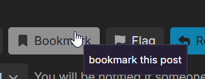
The outcome is as follows…
** It’s worth noting that the title text workaround is frowned upon from an accessibility perspective.
Hugo-OC
September 1, 2025, 11:20pm
7
Hi,
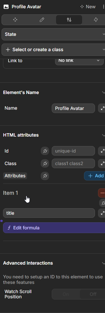
I don’t know if that is what you wanted but if you were looking for the standardized html tooltip :
You can leverage the title html atribute like this :
And you will get the tooltip without doing anything else.

 Thanks for the tips.