I’m assuming by “custom” you’re looking to do either a Bubble or a Radar chart, given those are the 2 that aren’t available in the plugin. Otherwise, it looks like most of the charts listed on Chart.js Samples | Chart.js should be possible with whats available in the plugin (at least according to the config > type) with some advanced tinkering.
When you toggle to “Advanced” you’ll get more granular control over the Labels, Datasets, and Options properties, which is where I’ve been able to apply a lot of my customizations. In the screenshot below, you’ll see where to change your “Mode” and how I’ve got no-code formulas (better readability for non-technical folks, particularly when mapping a collection to the property) mapped to the Labels and Datasets and a JS formula mapped to the Options. More on each below.
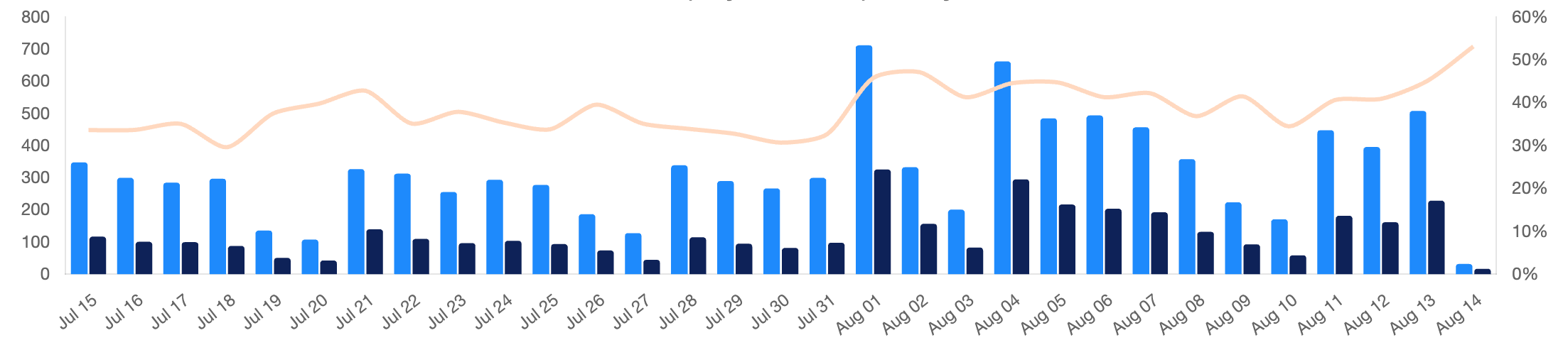
Labels - This is the simplest. In the example below this is the array of label values across the horizontal axis, eg [Jul 15, Jul 16, Jul 17, etc] .
Datasets - an array of object(s), where each object can be its own dataset, and where you can control the styling of each dataset. In the example below, I have a dataset for each bar, as well as one for the line, for a total of 3 objects. Some of the properties used here include: data (obviously the most important), type, order, label, stack, grouped, backgroundColor, categoryPercentage, barPercentage, borderColor, yAxisID, tension, and pointRadius. Note, some of these are applied to type:bar and some to type:line but I wanted to introduce the range of control you can apply. I recommend inspecting the Setup tab of the code snippets that accompany all the samples on Chart JS for additional ideas.
Options - this is where I do MOST of my customizations and have found its easier to switch from the no-code formula to JS formulas instead. This, plus a bit of knowledge of what is available in Chart JS, and some assistance from an AI like ChatGPT or Claude has unlocked a lot. Just take a look at the “formula” below to see what I’m
function formatPercentage(value) {
  // Use Intl.NumberFormat to format as a percentage with no decimal places
  const formatter = new Intl.NumberFormat('en-US', {
    style: 'percent',
    minimumFractionDigits: 0,
    maximumFractionDigits: 0,
  });
  return formatter.format(value);
}

const options = {
  responsive: true,
  maintainAspectRatio: false,
  interaction: {
    mode: 'index',
    intersect: false,
  },
  stacked: false,
  borderRadius: 2,
  plugins: {
    title: {
      display: true,
      text: "Lorem Ipsum",
      font: {
        size: 15,
        family: "'Inter', 'Helvetica', 'Arial', sans-serif"
      }
    },
    legend: {
      display: true,
      onClick: null,
      position: "bottom",
      reverse: true,
      labels: {
        boxWidth: 10
      }
    },
    tooltip: {
      callbacks: {
        label: (context) => {
          // Check if the dataset index is associated with the y1 axis
          if (context.datasetIndex === 2) {
            // Format the tooltip label as a percentage
            const formattedPercentage = formatPercentage(context.parsed.y);
            return context.dataset.label + ': ' + formattedPercentage;
          } else {
            // For other datasets, use the default label
            return context.dataset.label + ': ' + context.parsed.y;
          }
        },
      },
    }
  },
  scales: {
    x: {
      grid: {
        display: false
      }
    },
    y: {
      type: 'linear',
      display: true,
      grid: {
        display: false
      },
      position: 'left',
    },
    y1: {
      type: 'linear',
      display: true,
      grid: {
        display: false
      },
      position: 'right',
      beginAtZero: true,
      ticks: {
        callback: (value) => {
          return formatPercentage(value);
        }
      }
    },
  }
};

return options;
Sorry for the novel, but I hope this sheds light on the possibilities. Hope it helps.