The ultimate goal this time is to make toast component that have an action with parameters ‘Display seconds, Description’ , and just call it to get an alert, which can be used on any screen if it is placed.
It seems that Debug tool bar → Variable → Elements menu have listed Toggle - value or Alert - show has a state, and they seem refered as the states components… If we try to make customized components, it need to switch to component variables, not outside variables, I think.
But it is not work. So, to simpler the problem, I have a question as one simple problem I found.
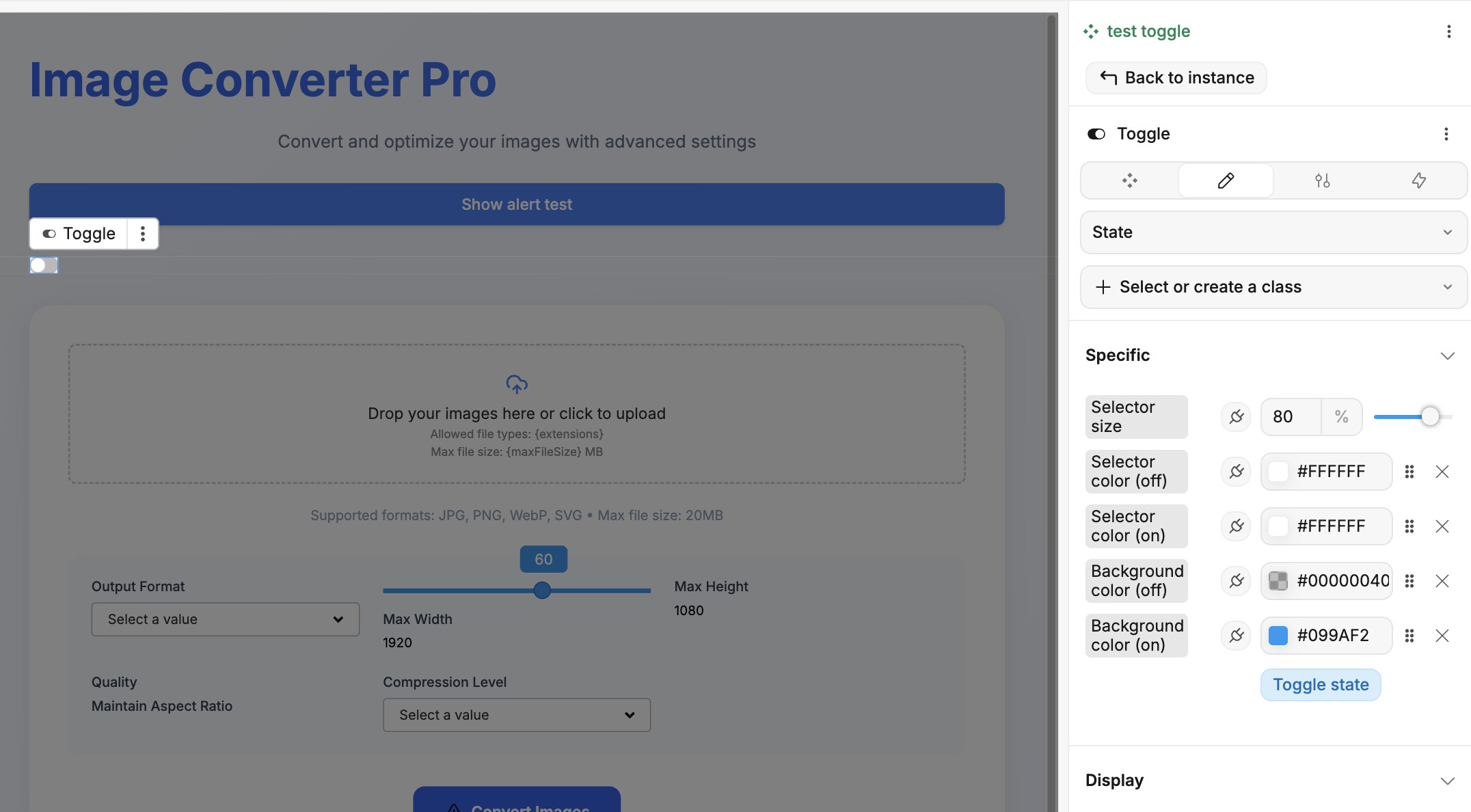
This time, when I componentised Toggle input, the
“Toggle state” button doesn’t work anymore. Could you let me know the reason for this?
I’m sorry if this is a misaligned question/direction, but I’m thinking of charging for this service and starting to use it once I have a clearer idea of the componentisation know-how.
For the Toast component, you might want to take a look at the newly released Popup feature!
When you want to Componentize components, you need to do a few things in order for it to work as originally:
Create a new value variable that is exposed outside the component.
Change the value of this variable when the toggle changes (as you would have done if it wasn’t inside a component)
Emit a trigger event and passing it the value
That’s the basic to make the component work. You can then create props in your component and link them to the original props of the toggle to maintain its features.
Once you wrap your head around how that works, you’ll be able to build even more complex components!
Hope that helps! There are a few resources around building components, including the documentation and some WeWeb videos
Hi jptrinh, many thanks for your guidance!
This is exactly what I needed, by creating a generic Toast function first, I can use it for everything from debugging functions to user notifications.
I’m a bit concerned about the “Toggle" spec, but I think it’s tied to variables via areas the user cannot touch. We will refrain from that kind of creation in the future.
And, I also saw one problem.
I added a parameter called ‘duration(ms)’ (default:3000), which allows the user to specify ‘how many seconds to open’ when show toast.
Then, on an "On mounted” event of the toast, I put actions, "Time delay” , and "Close this popup instance”.
The behaviour is fine on preview, but the problem is that even in the editor, the behaviour is that it closes 3 seconds after you start editing with ‘Edit’, so you can’t edit.
Should this be understood as a specification of the editor, or if there is a workaround, it would be helpful to know.
@KouichiAbe
I got the exact same problem with the popup closing in Edit mode haha
One way you could handle that is having a boolean prop “Disable auto-close” (or something like that). And in the onMount workflow, add a pass-through condition that will check that prop. This way you can prevent the workflow from running if the prop is activated.